Discover love, friendship and endless possibilities
WAPO & WAPA
Strategy & Planning
Product design
Mobile development
Quality assurance
2024
Wapo is an inclusive LGBTQ space for gay, bisexual, bi curious, and trans men, offering photo-verified profiles for safe connections. Wapa is an LBTQ+ dating app for women, fostering inclusivity, respect, and meaningful connections. It prioritizes safety with verified profiles. Wapo & Wapa Limited are pioneer in creating inclusive digital spaces that celebrate diversity and facilitate connections. Their mobile applications, are dedicated to enriching the LGBTQ+ community's social and dating experiences, offering a secure and friendly platform for individuals to meet, chat, and discover. Through innovation and commitment to authenticity, we aim to bring people closer, one match at a time.


CHALLENGE
Designing trust in a frictionless dating experience
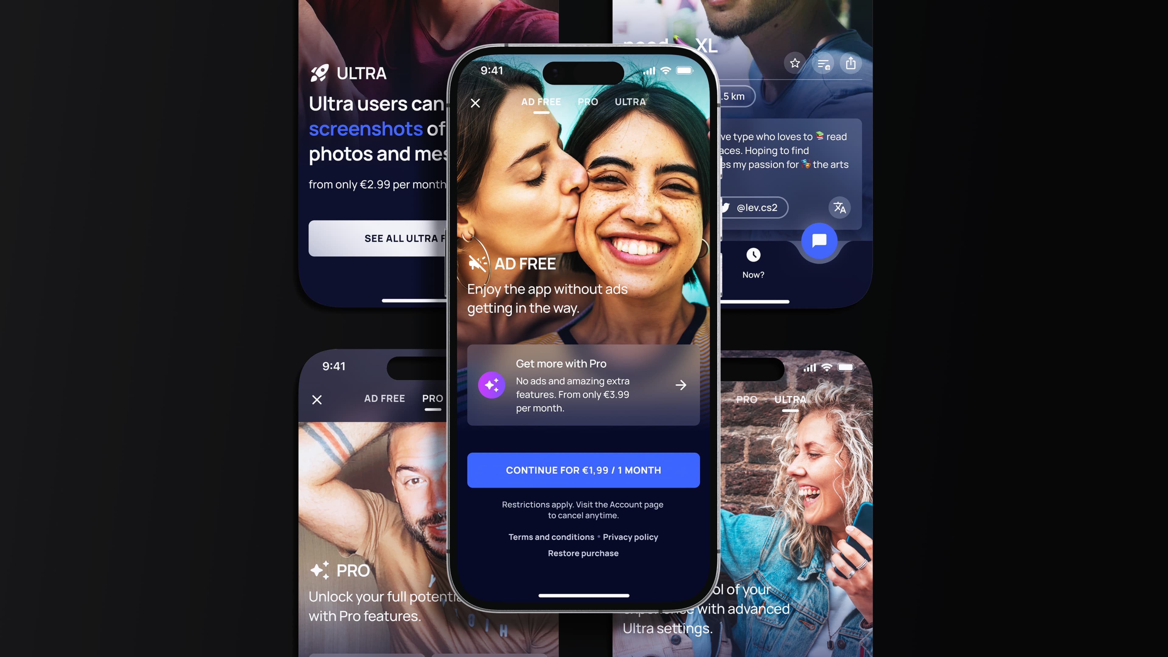
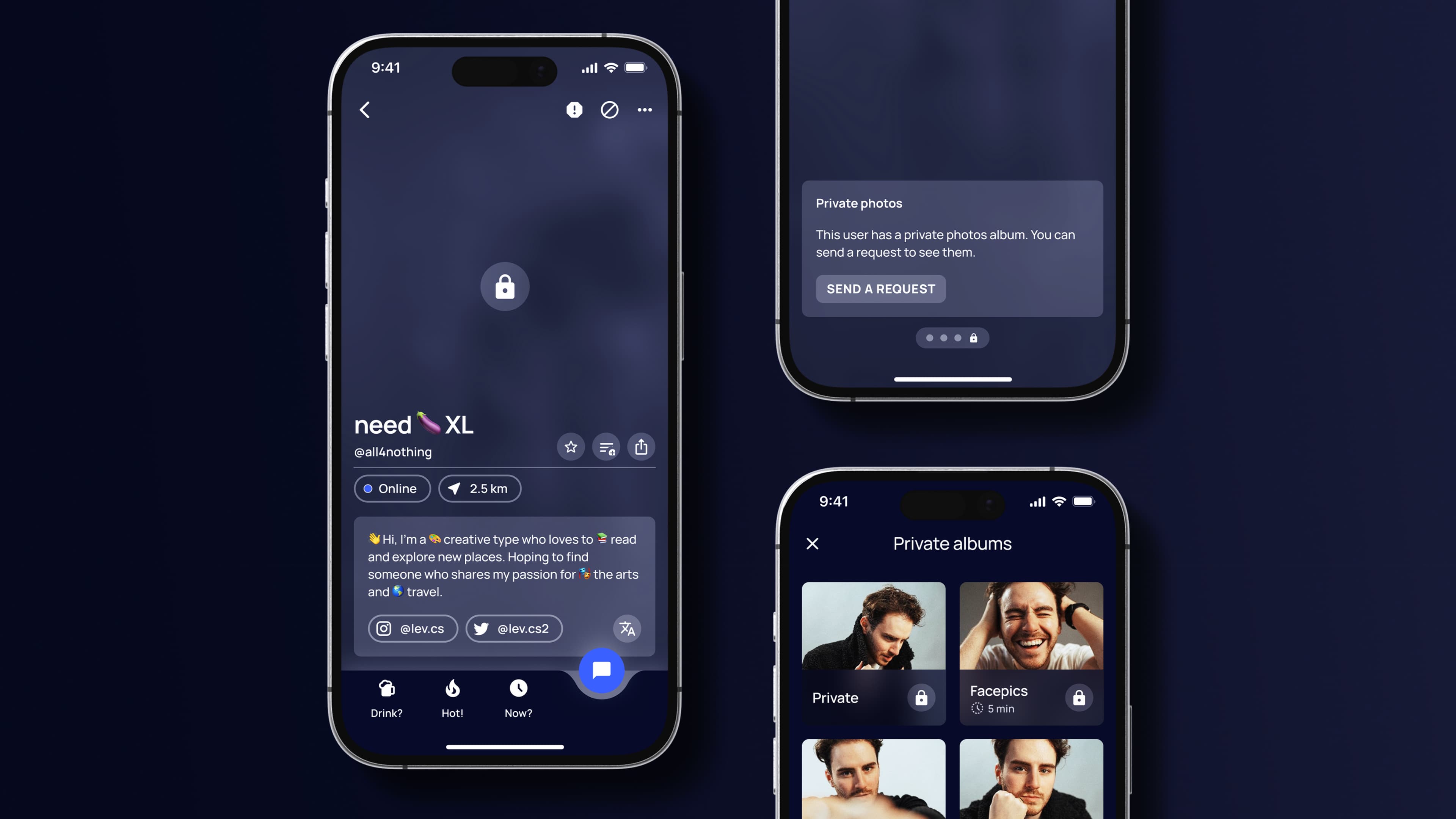
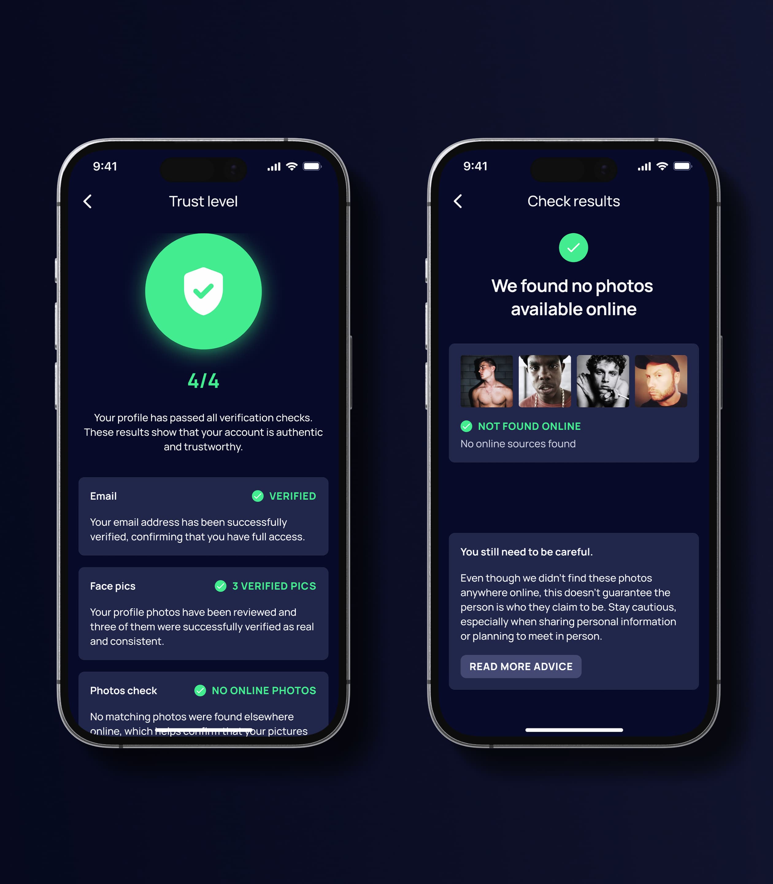
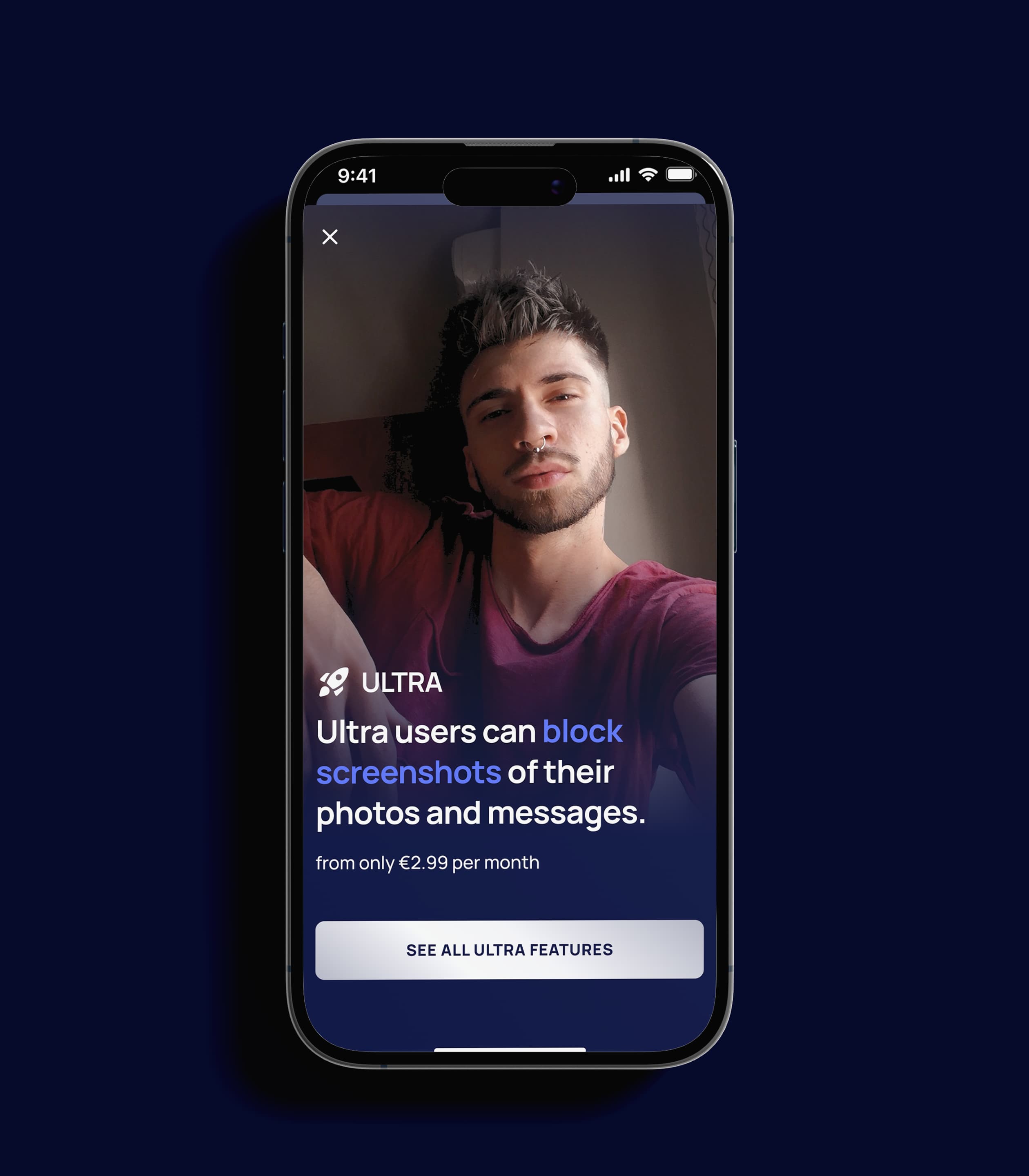
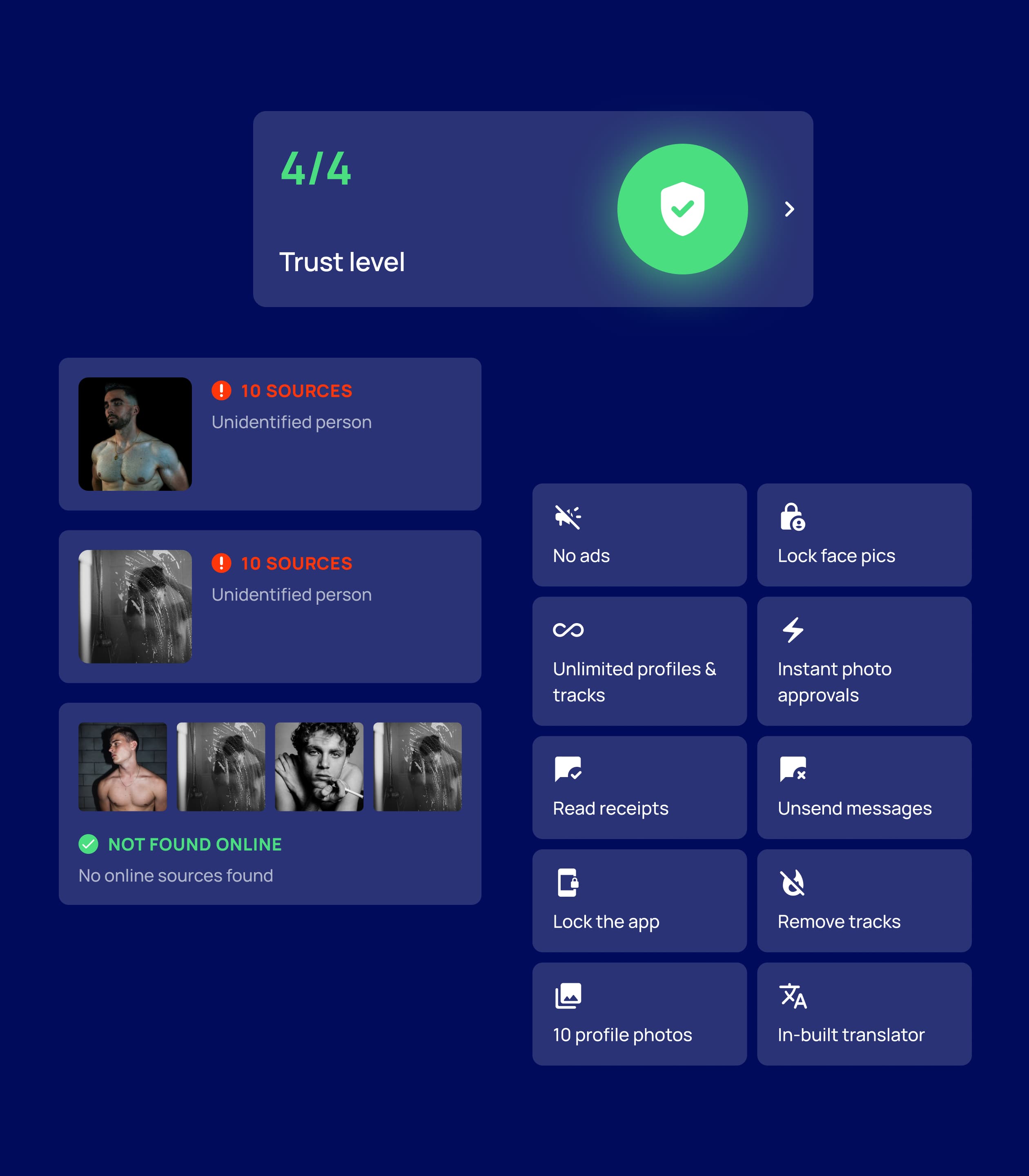
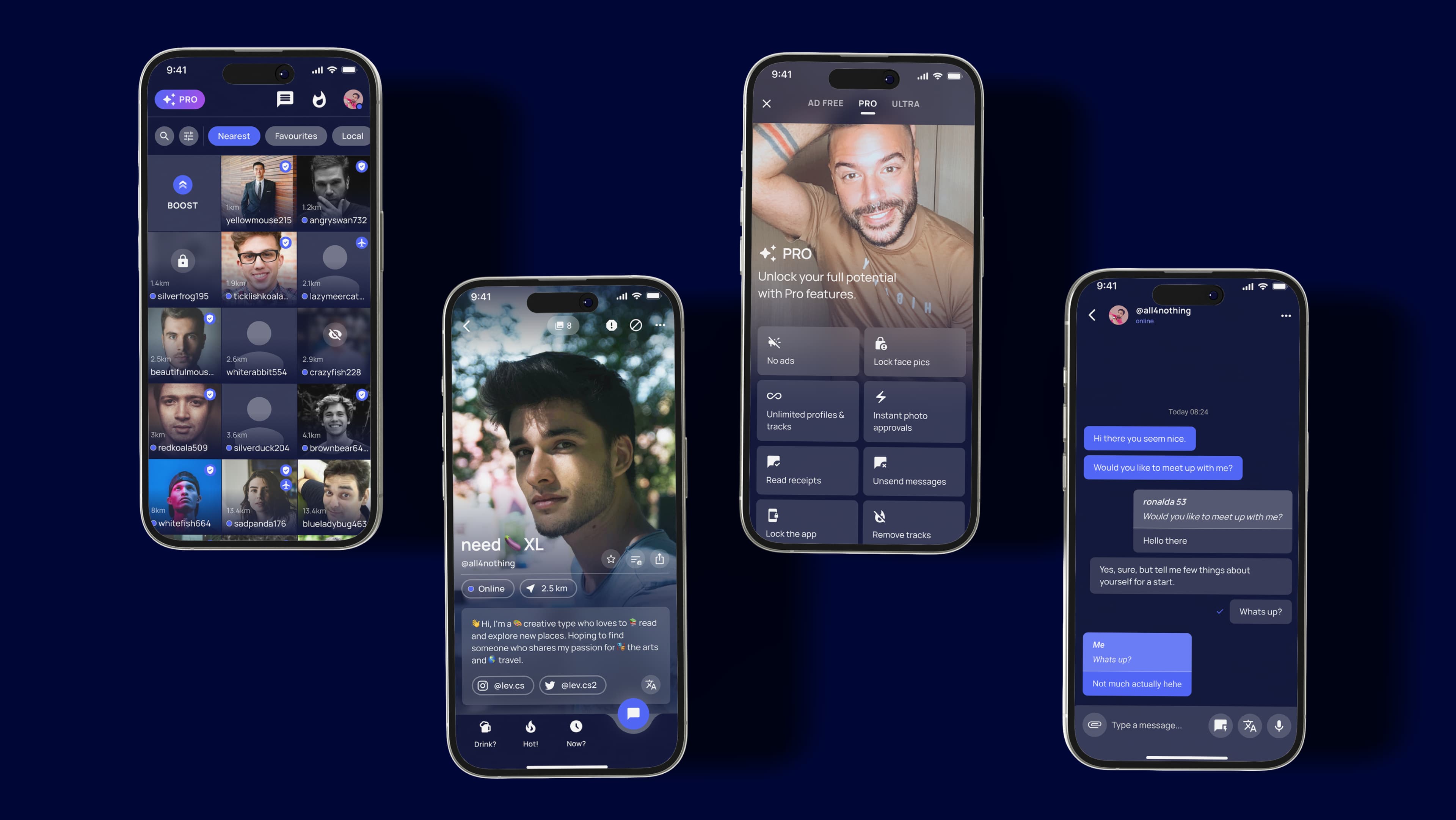
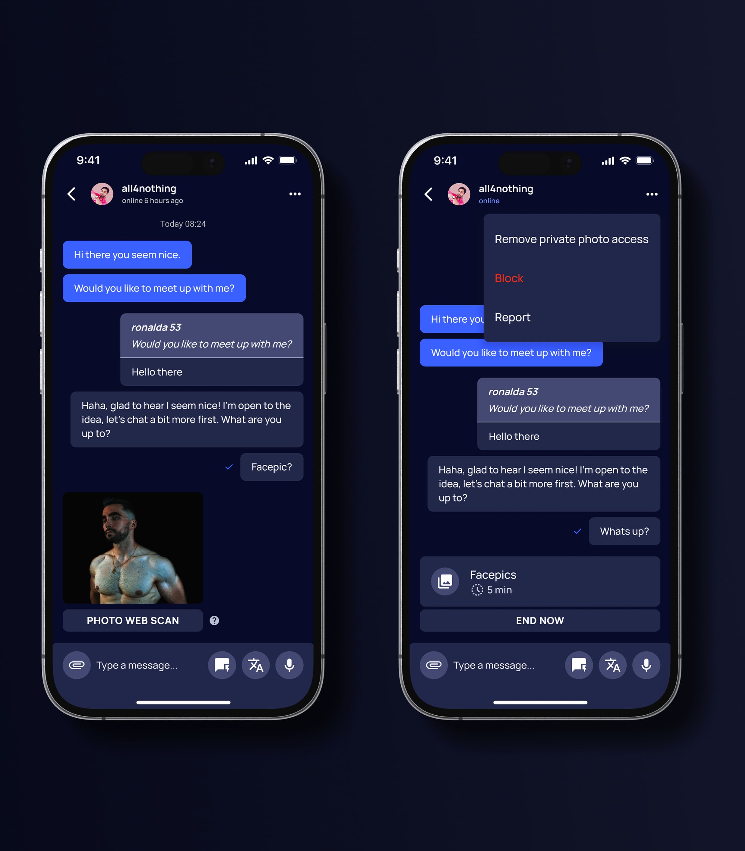
Designing and developing Wapo required addressing the challenge of building trust and authenticity in a digital dating environment, without introducing friction such as mandatory ID verification. The platform needed to enable users to confidently explore connections through features like photo verification, favorites, and profile insights, while ensuring a seamless, inclusive, and engaging experience that supports meaningful interactions and real-world connections.
APPROACH
We created a new experience focused on usability and clarity
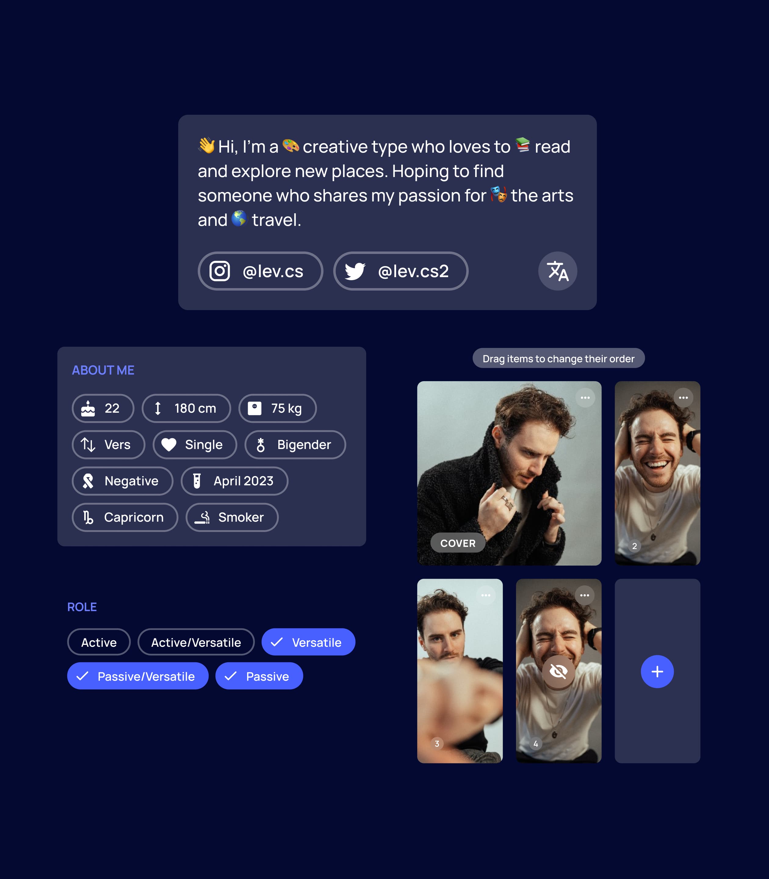
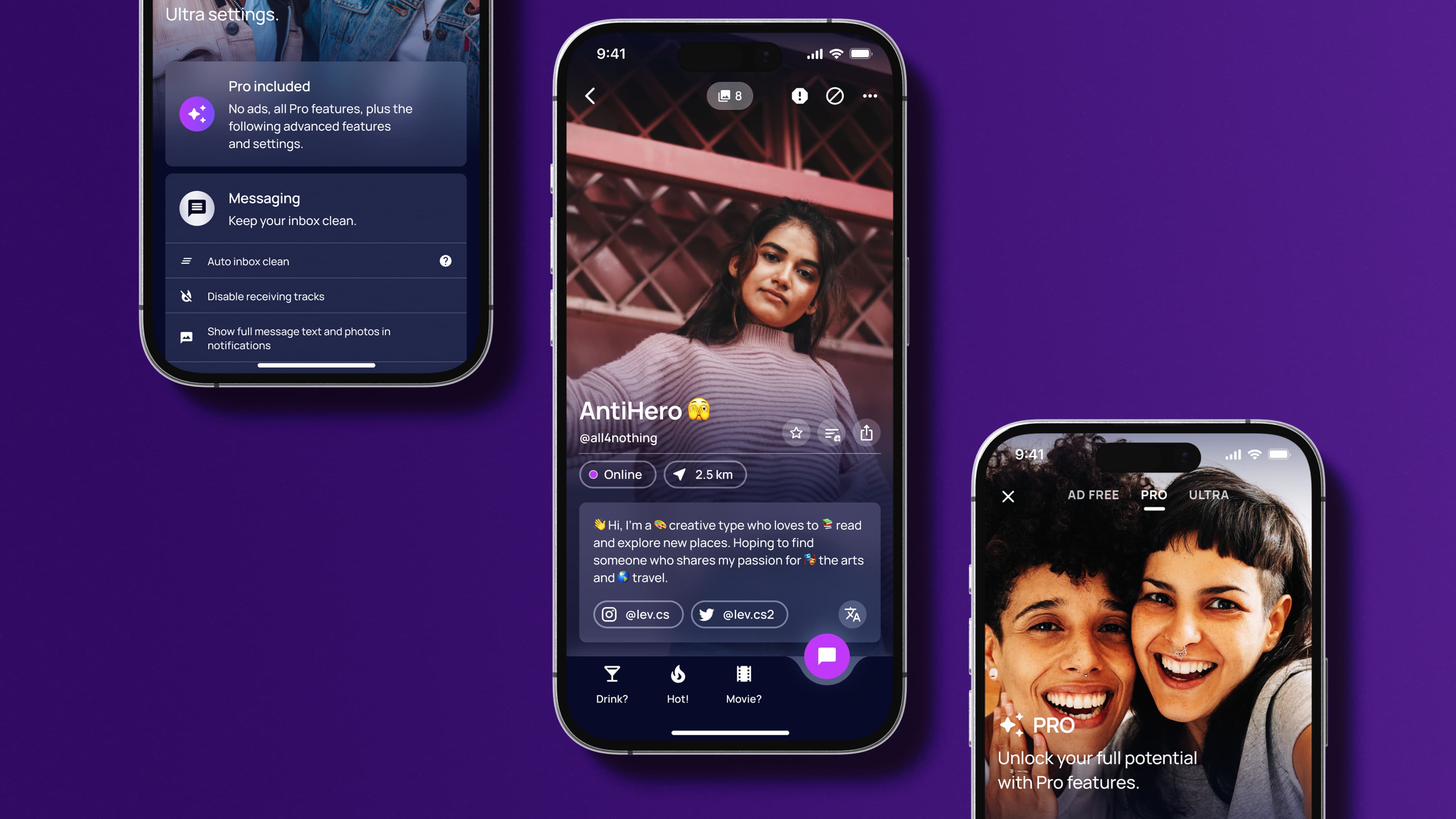
The main focus was to elevate Wapo's user experience, while undertaking a complete UI redesign. With a focus on enhancing the overall aesthetic appeal and functionality, numerous features received meticulous overhaul. From refining visual elements to streamlining user interactions, the redesign aimed to create a more intuitive and visually pleasing environment. The result is an improved Wapo app that seamlessly merges style with enhanced usability for a more engaging and user-friendly experience.
VISUAL SYSTEM
The system was designed to scale across all touchpoints, ensuring consistency, clarity, and flexibility across the entire experience.
Colours
The palette is built around two core brand colours — blue (Wapo) and purple (Wapa) — used for identity and key interactions. Extended shades create depth and hierarchy, while neutral greys provide structure and readability.
Typography
Space Grotesk carries the intellectual authority of the headings, sharp and structured without being cold. Public Sans handles body text with the clarity that complex subject matter demands. Two typefaces, one register.
UI Design
A cohesive interface system that brings together components, typography, and colour. Designed for consistency and scalability, it ensures clarity and ease of use across all touchpoints.
REDESIGN IMPACT
The redesign focused on simplifying the experience and improving clarity across the platform. Key user flows were streamlined to reduce friction and make interactions more intuitive. A unified system was introduced, creating consistency while supporting different user needs. Profiles and interactions were refined to feel more personal, flexible, and easy to navigate.
EXTENDING THE SYSTEM
Originally created for Wapo, the system was later extended to Wapa, adapting to a different audience while maintaining the same visual and interaction principles. The foundation remained consistent — components, typography, and layout — while colour, tone, and certain features were adjusted to better reflect Wapa’s identity and user needs. This allowed the system to scale efficiently across both products without losing clarity or cohesion.
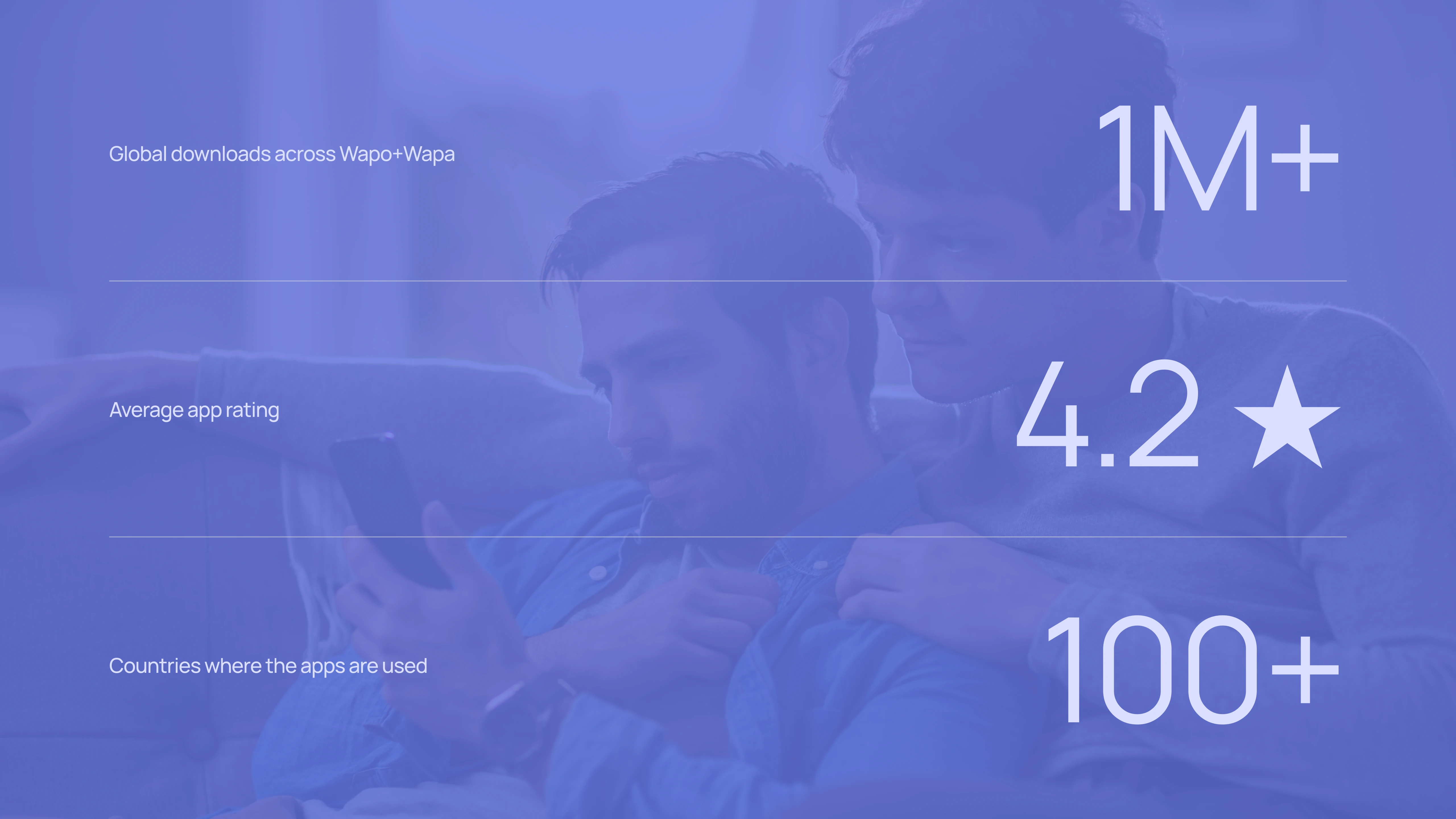
THE OUTCOME
A scalable and cohesive system that unifies Wapo and Wapa, creating a clearer and more intuitive experience across both products. Improved structure, refined interactions, and consistent design principles reduce friction and support usability, while providing a flexible foundation for future growth.